Snak Online
Snak Online was a brand experiment created by No Silence Media.
Overview
It was our goal to create a news aggregation site built on Wordpress, with the twist that articles could be organized by how long it takes to read them. The timing of the articles would be categorized by how long it might take someone to eat a snack, such as an apple. Hence the brand "Snak."
Brand
The idea of the website was customizable content for people to consume during their free time, however long they might have. We wanted this to be depicted through different snacks, which we decided based on types of snacks people usually have, and how long people might take to consume them. This was based on, uh, lots of anecdotal testing.

To make the icon and the logo, we decided on a more "modern" look, with some quirky and fun aspects mixed in.
We also made the "k" in the logo the "basket" that holds the snacks in the icon. This was done with intention of animating the logo, which was never done.

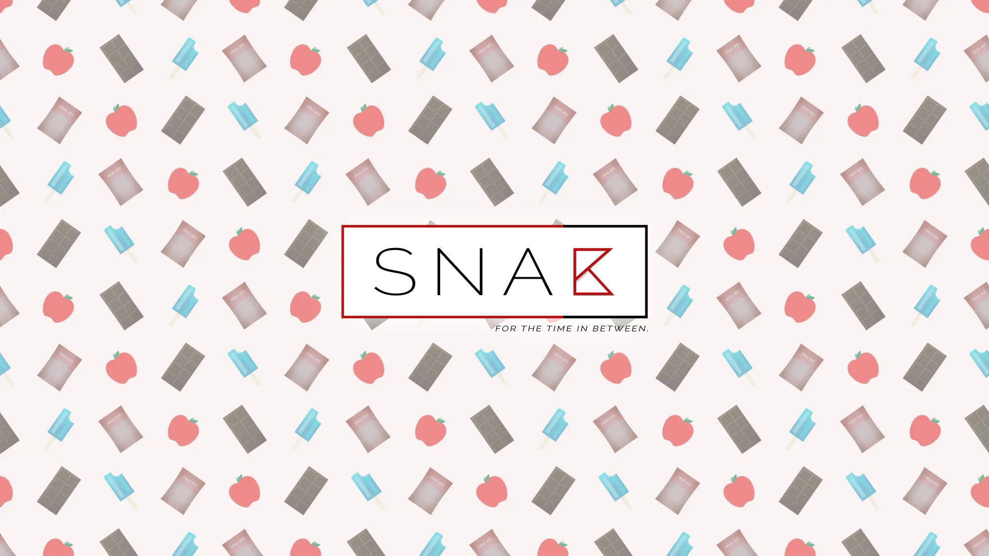
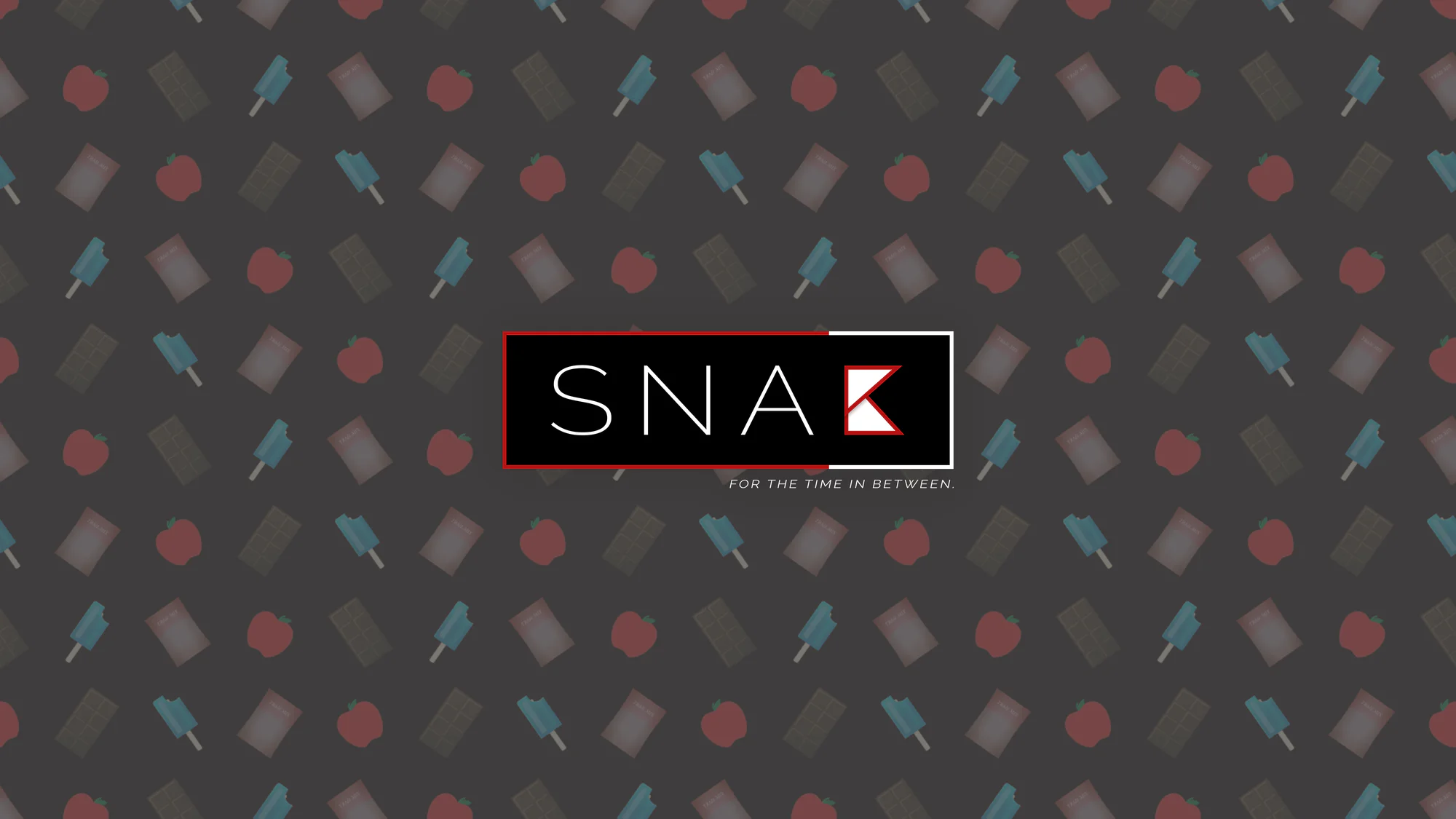
We also created some fun wallpapers for the brand:
Mobile Website
We wanted the website to be a pleasant experience that made it easy to view content, share it, and find similar content. The purpose of the website was to provide an excellent reading experience.
The headline feature of the site was content that can scale to the user's free time. As such, we provided a timeline interface to better filter down content matching the time.
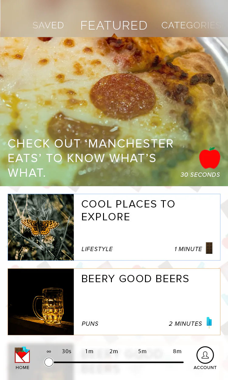
The timeline was placed prominently near the bottom of the screen to make it easy to access for people just browsing with their thumb. Likewise, the rest of the interface could be navigated using gestures (left, right, up, down) to reduce finger strain.
Article View
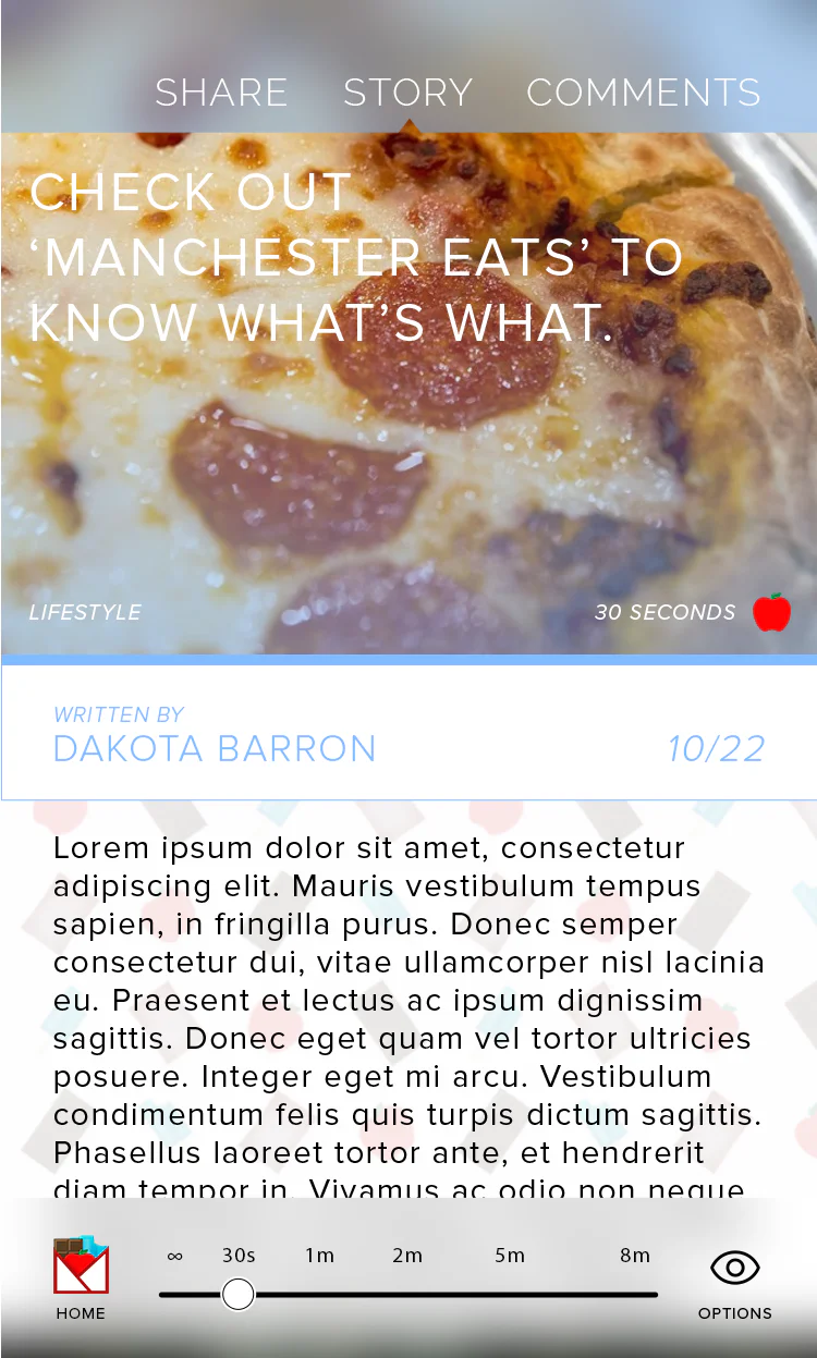
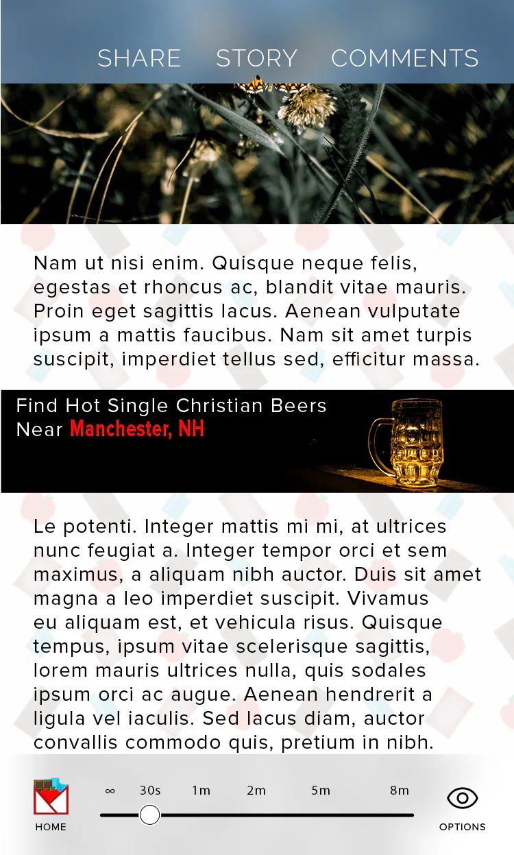
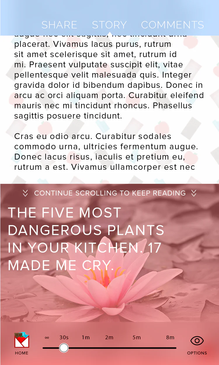
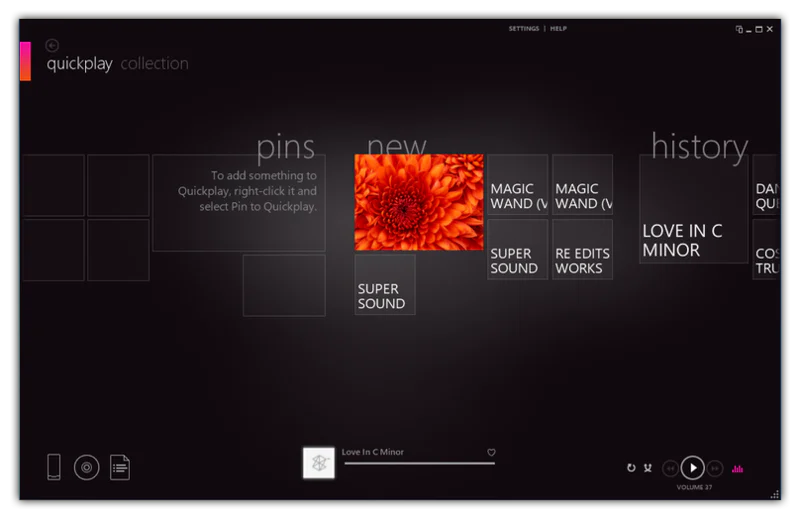
A lot of this design was inspired by Microsoft's Metro design language, a personal favorite of mine.
Conclusions
The project was never finished, and No Silence Media moved onto other projects. However, this is still one of my favorite explorations in User Interface design, and I hope to design something like this in the future.